Musings: Steven Heller, "I Heart Design: Remarkable Graphic Design Selected by Designers, Illustrators, and Critics", 1
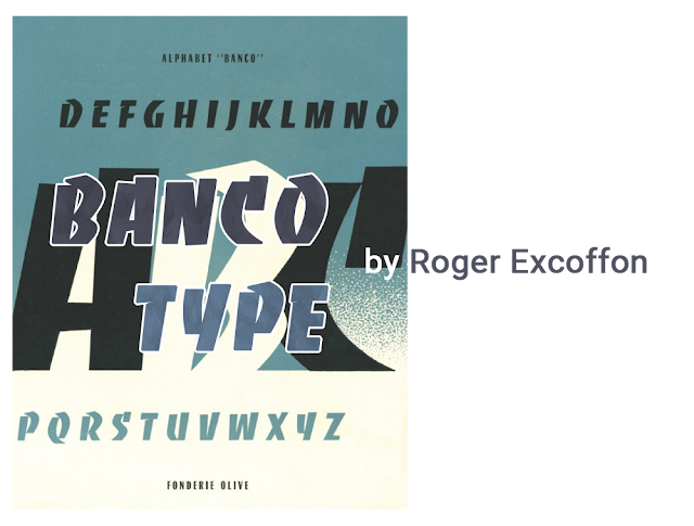
Banco Type is a display typeface - something used for large-size headings and inspired by hand-painted signs and calligraphy. Display typefaces tend to be more eccentric and aim at drawing attention to them, rather than improving readability - they are not intended for long text passages anyways.
Highsmith also mentions other fonts by Excoffon: Mistral (1953), a casual script typeface modeled after Excoffon's handwriting, Choc (1955), designed after Japanese brush techniques, the unusual Calypso (1958) and Antique Olive (1962-66) - Antique being the generic French name for sans-serif fonts, and Antique Olive being Fonderie Olive's answer to other popular sans-serif fonts like Max Miedinger's Helvetica (1957) and Adrian Frutiger's Univers (1957).
While both Helvetica and Univers are neo-grotesque fonts based on Akzidenz-Grotesk, a famous 19th century sans-serif fonts, Antique Olive features a more humanist, non-mechanical design.
Understanding some lettering terms
Antique, Gothic, Sans-Serif are the same thing - typefaces lacking the extension features called serif at the end of the strokes.
Grotesque are an early family of Sans-Serif typefaces pioneered in the 90th century. They are also called realist typefaces for their practicality and simplicity. Neo-grotesque typefaces are a revival of the traditional grotesque typefaces in the 1950s, and are a direct evolution of those.
Geometric are typefaces that replicate almost perfect geometric shapes and proportions. These originated in Germany in the 1920s.
Humanist typefaces are inspired both by Serif fonts, traditional lettering and calligraphy. They often have stroke modulation - strokes vary in with along the line or use alternating thick and thin strokes.


Comments
Post a Comment